Accessibility and sustainable web design
Objective
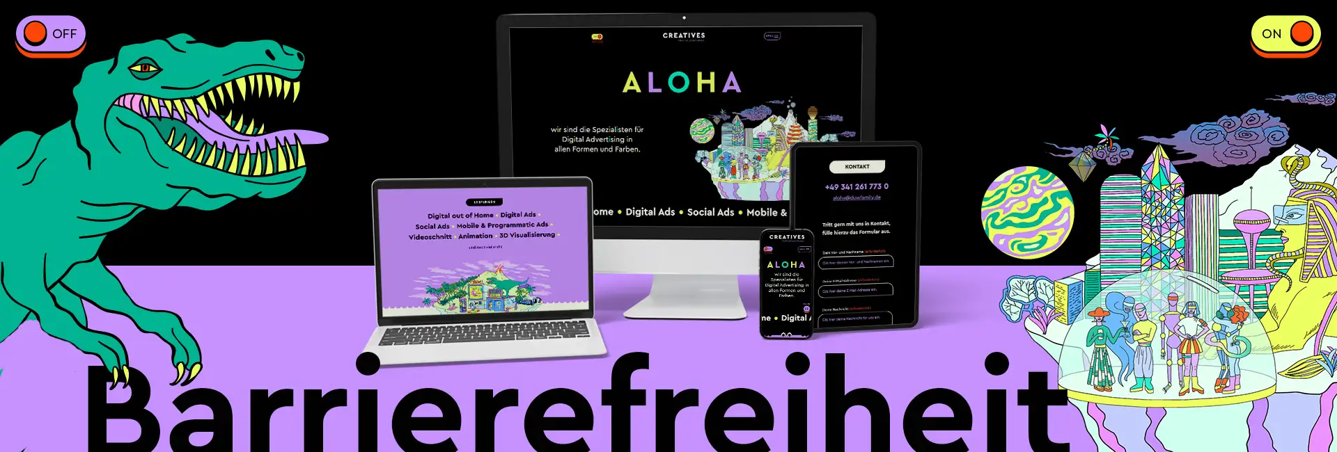
How do you design and program a website that is accessible, uses as little energy as possible – and is still fun to use? That's exactly our goal. Landing page For our creatives, the specialists in digital advertising. A website that is easily accessible, resource-efficient, and strikes exactly the right tone: friendly, clear, with character.
Conceptual framework
Our approach? Deep immersion. We delved deeply into the subject matter, developed our own checklists – and these became the guiding principle through design and code. Structure, navigation, readability: everything follows the principle of "as simple as possible, as elegant as necessary".
Two modes, one goal
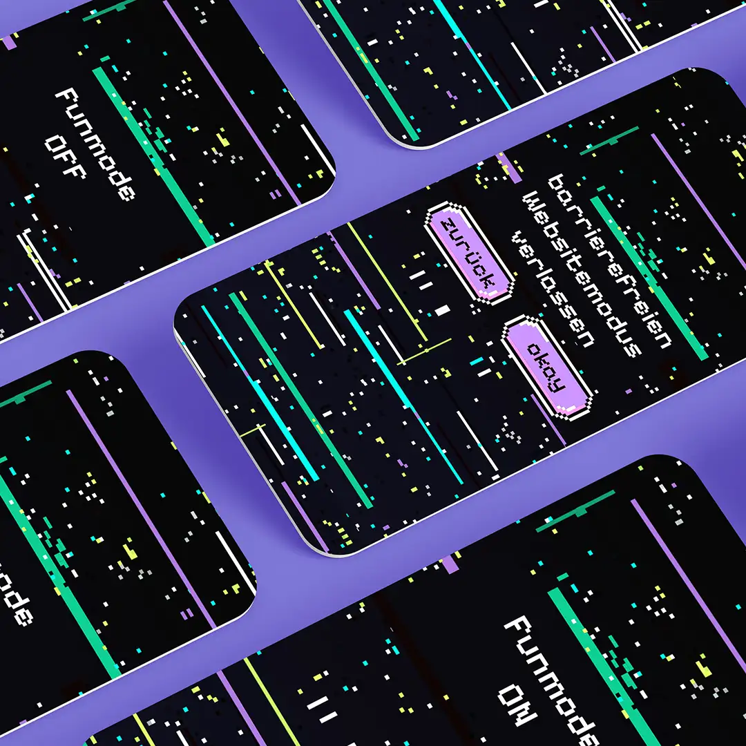
The site deliberately starts in accessible mode – minimalist, functional, and straightforward. Users can switch to fun mode via a button. There, they'll find more animations, more colors, more playful elements. Switching modes demonstrates the impact of design – while always remaining inclusive.
Design and visual language
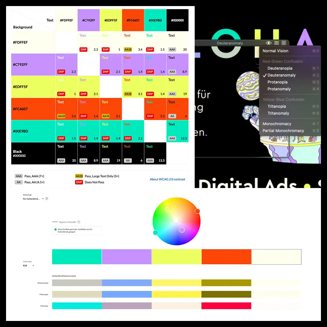
We prioritize clarity over clutter: a reduced color palette, strong contrasts, and easily readable typography. Everything has been tested – for accessibility, comprehensibility, and impact. Colors are never used in isolation but are always complemented by shapes, icons, or typography. And yes: fewer colors also mean less data.
Media use and performance
Illustrations? Where they make sense, as SVG or Lottie – lightweight, scalable, and beautiful. Videos only where they're truly needed. We've consistently compressed images. The site runs in dark mode – not only stylish but also energy-efficient. Fast, streamlined, and appealing.
Forms and Interaction
Contact forms can be complicated – but they don't have to be. We focus on permanently visible labels, clear focus states, and helpful feedback. Error messages appear not only in color but also as text! And in the end, you even get positive feedback – because good UX also means empathy.
Code and sustainable web design
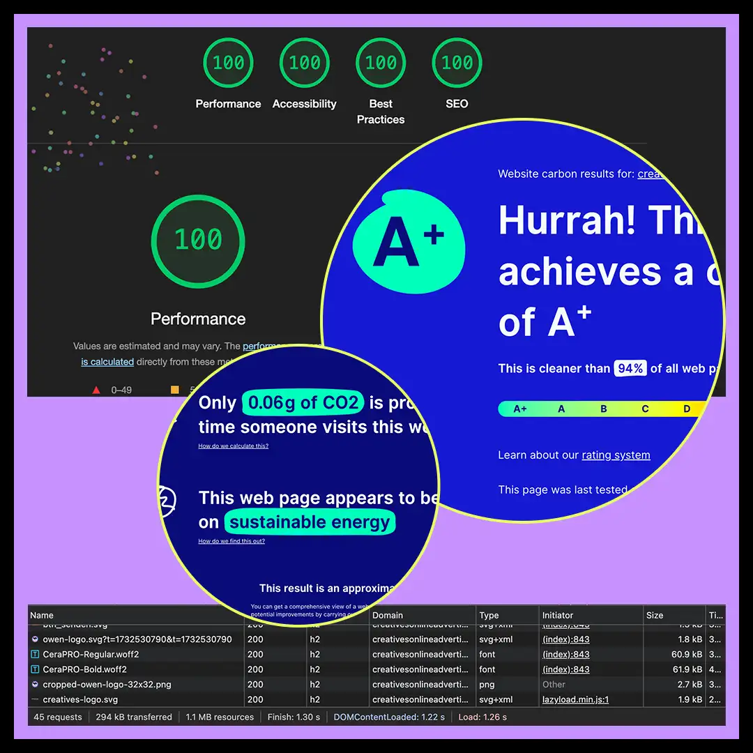
Everything runs in the background in a resource-efficient manner: minified code, hardly any plugins, no cookies. The site is lightweight, loads quickly, produces little CO₂ – and is hosted sustainably. That the Landing page from Carbon website We're naturally delighted that it received an A+ rating. Even more pleasing is the fact that you can feel the difference when using it.
Our learning, your opportunity
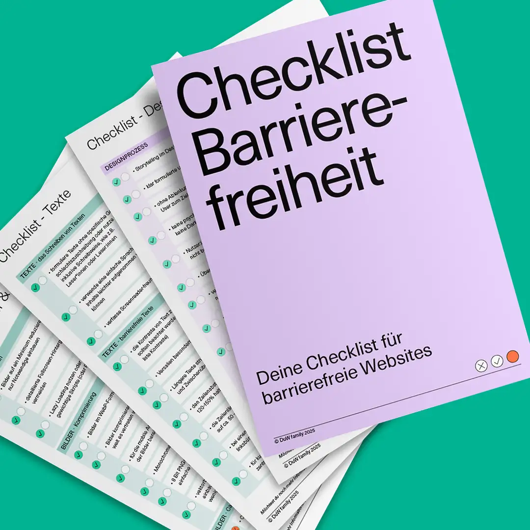
In the course of our work on this site, we have developed comprehensive checklists that we can use to check the accessibility of websites. Here's a glimpse → LINK
If revising your website or using the self-assessment checklist is also important to you, feel free to contact us.
Services provided in this case: